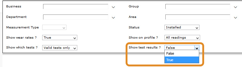
When generating the Belt Wear and Trend report, there is an option to include test results on the report. This prints the test results in a grid, after the graphical section of the report.
The results appear as shown below. The actual wear results are the larger (top) number in each cell. They give the measured thickness result at that X location. There are also smaller numbers in brackets below each result, and some results are coloured red.
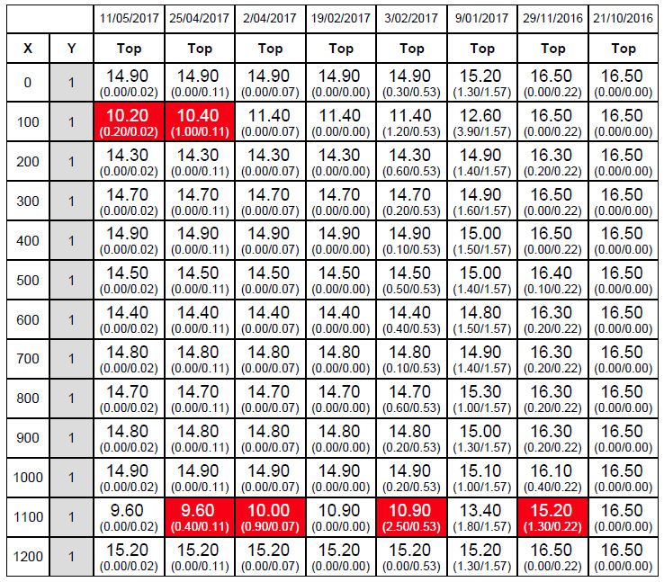
These numbers represent the difference in wear rates at a particular location and average wear rates over the whole belt. The bracketed number on the right is the average difference between the current wear results and the previous wear results across all measured points. For example, if you look at the results for 11/05/17 in the example above, the figures on the bottom right are all .02, which is the average figure for that belt. The number on the left is the actual difference at that x coordinate between the current and previous (the top number in the corresponding cell in the 25/4/17 column) wear result.
The red conditional formatting is applied to cells where the difference in wear compared to the average difference in wear is greater than 300% - indicating the potential for a gouge or groove forming. You can see the red cells, for example, the results at x-100 for the 11/5 & 25/4 have a big differential between the left bottom number and right bottom number.